by Kip | Apr 16, 2015 |
The Utah Historical Review is a student-run history journal out of the University of Utah. They needed a logo which spoke directly to their sense of place, while also feeling “timeless.” To achieve their goals we came up with a crisp and clean round logo with the publication’s name in collegiate style block letters. We then added stylistic recreation of two of Utah’s great and timeless landmarks, the Wasatch Front mountains, and famous Delicate Arch. These two geographical features serve to represent respectively, northern and southern Utah, which the journal...

by Kip | Apr 15, 2015 |
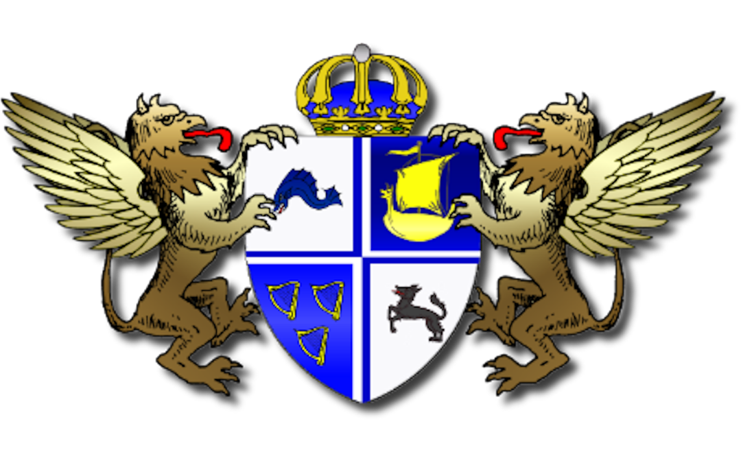
A coat of arms created for a fictional kingdom nestled away in a forgotten corner of the world. This design took an original work by the owner and translated their vision into a more traditional heraldry motif.

by Kip | Apr 15, 2015 |
Designed for DJ and composer, 57 Digital Mice, this logo incorporates visual elements which don’t immediately make sense when viewed one at a time, but come together to allude to the whole of the artist and their work.

by Kip | Apr 15, 2015 |
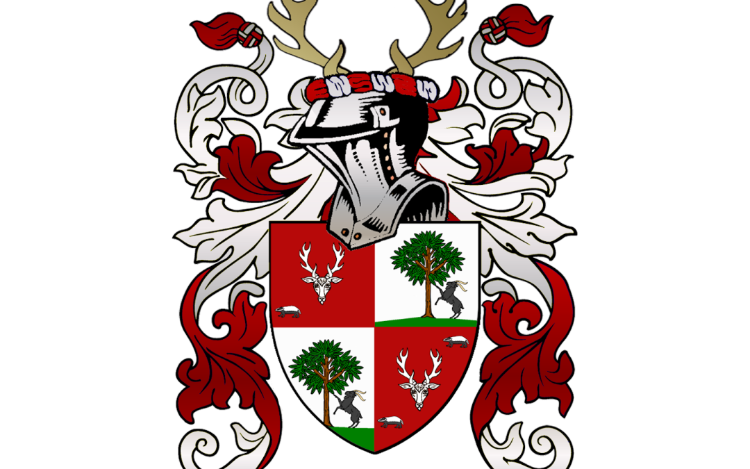
This couple wanted their historic coats of arms from both of their families differenced and quartered to provide a unique emblem for their joined family.

by Kip | Apr 15, 2015 |
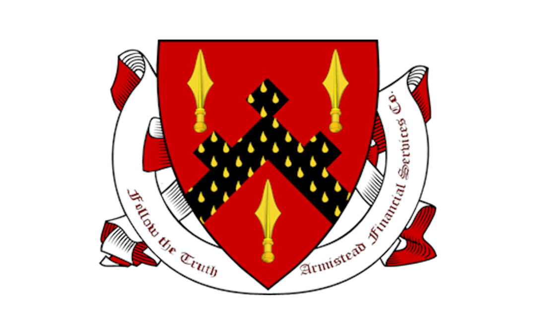
The owner of Armistead Financial Services wanted a logo for his family-owned business to reflect the proud history of his family. Nothing better illustrates such ties to an illustrious past as a coat of arms logo. We took the coat of arms of the owner’s ancestor and created some differences to make it his own, while still keeping a firm allusion to the old...


